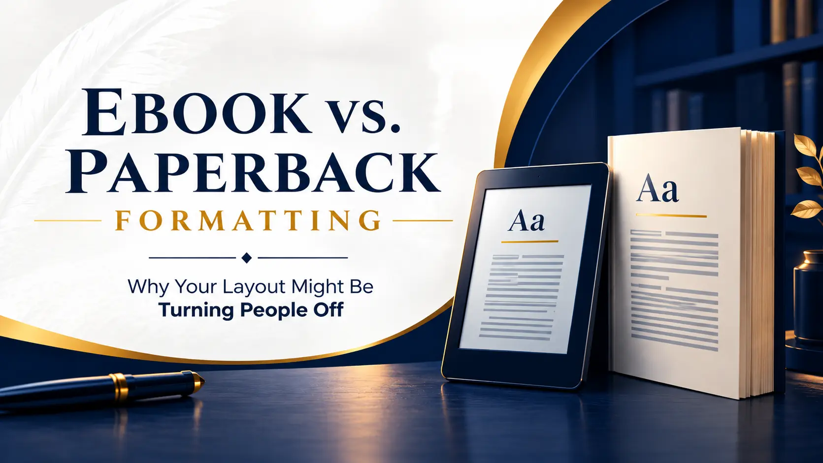
Ebooks need text that bends to fit any screen, and paperbacks need a fixed layout built for a physical page. That’s the heart of ebook vs paperback formatting, and it’s where plenty of self-published books go sideways. Readers feel something is off long before they can say what.
Maybe the paragraphs look cramped on a phone. Maybe the first words of every line vanish into the fold of the paperback. Either way, nobody leaves a review blaming the layout. They blame the book and move on.
So here’s the plan. I’ll show you how the two formats really differ, the mistakes I see authors make most, and a workflow that keeps both files clean without doubling your effort.
Why Readers Quit Books That Look Wrong
Good formatting is invisible. Nobody thanks you for it, but everyone notices when it’s missing, and that’s a bit unfair.
Here’s a scene that plays out all the time. A first-time author uploads the same Word file to Kindle and to print, figuring one file should be enough. On a phone, her tab-key indents turn into weird gaps. In the paperback, the words squeeze against the binding, so readers have to bend the spine just to see where a line starts.
Same manuscript, two bad experiences. Ever put a book down after ten pages and not know why? Reviewers rarely write “gutter margin too narrow.” They write “hard to read” or “looks amateur,” and a comment like that can sink a rating fast.
Ebook vs Paperback Formatting: The Core Differences
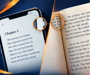
Think of an ebook as a set of instructions. A paperback is more like a finished photograph. Mixing up the two is behind most formatting trouble.
Reflowable vs Fixed Layout Explained
Most ebooks are reflowable. The reader picks the font size, typeface, and spacing, and the text rearranges itself to fit. You don’t get to decide where a page ends, since pages in the print sense don’t exist here.
Fixed layout pins everything in place, a lot like a PDF. It makes sense for picture books, comics, and illustrated cookbooks, where words and images must stay together. For a novel or standard nonfiction, though, it means pinching and zooming on a small screen, and that gets old fast. Amazon explains the difference between reflowable and fixed-layout eBooks in its KDP help pages.
So the reflowable vs fixed layout decision comes down to a single question. Does your book depend on exact placement, or on words?
Ebook vs Paperback Formatting Starts With Mindset
In print, it’s the other way around. You set the trim size, margins, page breaks, and running headers, and the printer delivers exactly what you sent. Once copies ship, every flaw stays.
With an ebook, you write rules and each device interprets them. With a paperback, you’re the designer, and you check every spread by eye. That’s why one file almost never works well for both.
Paperback Interior Layout: Getting the Physical Page Right
A well-made paperback interior layout reads without effort. That ease comes from a few decisions you should settle well before the final proof.
Trim Size and Margins
Trim size is the finished page dimension, and nearly everything else follows from it. Popular choices for trade fiction and nonfiction include 5 by 8, 5.5 by 8.5, and 6 by 9 inches. Pick early, because switching later reflows the whole book and can wreck your page breaks.
Trim size and margins work as a pair. Bigger pages can take wider outer margins and larger type, while small pages feel tight in a hurry. A comfortable outer margin also keeps a reader’s thumbs off your words. If you’d rather not guess, a professional book formatting service can match the trim size to your genre.
Gutter Margin for Print Books
The gutter is the inner margin where pages curve into the binding. A gutter margin for print books must be wider than the outer margin, since some of that space disappears into the spine. KDP sets minimum inside margins that grow with page count, so a thick book needs more room than a slim one. You can check the current numbers in Amazon’s guide to trim size, bleed, and margins.
Try this. Order a proof and hold it the way a reader would, without pressing it flat. If the first letters of each line are hard to read, widen the gutter and proof again.
Typography Print Readers Feel
The small stuff is what makes a book look finished:
- Widows and orphans: Watch for lone lines stranded at the top or bottom of a page.
- Justified text: Turn on hyphenation, or you’ll get big, awkward gaps between words.
- Running headers: Author name on left pages, title on right, and none on chapter openers.
- Chapter openings: Start on a right-hand page with generous space above the title.
- Images: Use high-resolution files, since 300 DPI is a common print recommendation.
Ebook Formatting Guide: Making Text Flow Cleanly
Every good ebook formatting guide starts with the same rule. Use styles, never spaces.
Styles Beat Manual Fixes
Stop tapping Tab or Enter to force a layout. It looks fine on your screen, then falls apart on someone else’s. Set up paragraph styles for body text, headings, block quotes, and scene breaks instead, and every device will read them the same way.
I’d skip drop caps and fancy ornaments unless you’ve tested them on several devices. Plenty of e-readers choke on them. A broken drop cap looks worse than none at all.
Fonts and Spacing Readers Control
It’s tempting to force your favorite typeface. Don’t. Many readers choose their own font in the app, and overriding it feels pushy.
Use relative units like ems for indents and spacing, so everything scales when someone bumps up the text size. In fiction, a first-line indent of about one em works nicely, dropped after headings and scene breaks. Nonfiction often reads better with a little space between paragraphs. Whichever you pick, stay consistent.
Navigation, Images, and Links
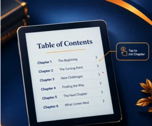
Nobody flips pages in an ebook, so the table of contents is the map. Build it from your heading styles, then click every chapter link yourself.
Keep image files small, add alt text, and don’t hide text inside pictures. After that, test on a phone, a tablet, and an e-ink device if you can borrow one. KDP formatting rules also differ between ebook and paperback uploads, so read Amazon’s Kindle Publishing Guidelines before publishing.
Book Formatting Mistakes That Hurt Both Formats
Picture an author who designs a gorgeous print layout first, with a decorative header image on every chapter. She exports the same file for Kindle. On a small screen, that image fills the display and pushes each chapter title onto the next screen.
It’s one of several book formatting mistakes that keep turning up:
- Using one file for both outputs. The formats follow different rules, so each needs its own build.
- Skipping the proof. A screen preview can’t show you how a gutter feels in your hands.
- Inconsistent scene breaks. Switching between asterisks, blank lines, and ornaments confuses readers.
- Messy front and back matter. Keep the title page, copyright page, and dedication in the same order every time.
- Ignoring tiny screens. Long, unbroken paragraphs feel heavy on a phone.
The One Source, Two Builds Framework
Here’s the method that dodges most of those problems. Keep one clean master manuscript that uses styles only, then create two separate builds from it. If you’ve wondered how to format a book for Kindle and print without doing the work twice, this is how.
- Lock the text. Finish book editing before layout begins.
- Build the print file. Set trim size, margins, gutter, and headers.
- Build the ebook file. Strip out fixed spacing, headers, and page numbers, and let the reader control the rest.
- Compare one chapter side by side. Check headings, breaks, and images in both.
- Proof both. Order a printed copy and load the ebook on real devices.
Of all the self-publishing formatting tips out there, this one’s the simplest. Never edit text inside the finished files. Fix it in the master, then rebuild both. Tools like Vellum or Atticus can export both formats from one manuscript, which saves a lot of grief.
Once you work this way, two formats stop feeling like double the work. You get one editing pass and two predictable outputs. Good book layout design then comes from clear rules, not guesswork.
Your Next Step: Test One Chapter Today
Don’t reformat the whole book tonight. Pick one chapter and run it through both builds using the framework above.
Order a printed proof, then read that same chapter on your phone. Within minutes you’ll catch gutter trouble, cramped paragraphs, and odd breaks. Treat ebook vs paperback formatting as two separate jobs sharing one clean source, and readers will keep turning pages instead of closing the book.
Need a starting point? Our book formatting team can build both files for you, and we also handle Amazon KDP publishing from upload to launch.